Children Incorporated
Donor MGMT System Redesign
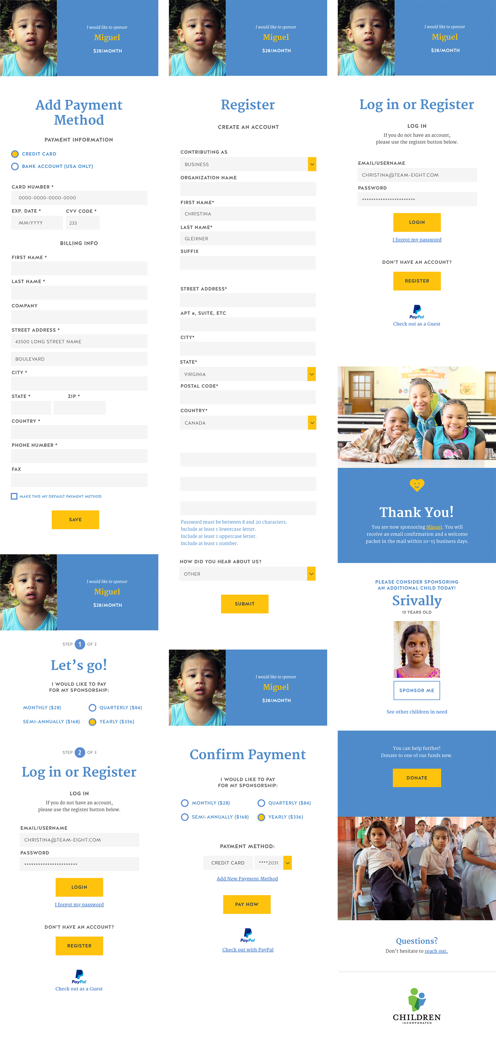
This project was a great opportunity to use a lot of fundamental UX practices from user research and testing to a reenvisioned design based on meeting the the newly prioritized user needs. For this project, I lead the small team of UX designers at Team Eight.
Carefully conducted user research yielded insights into what Children Incorporated’s current donors value as well as what they were missing. This in turn informed a new strategy: build experiences that maintain the user’s emotional connection with the children and the organization.
Next, we identified the most critical areas of interaction—which areas of the site and app do we need users to interact with most? Which need the most improvement to their functionality? We implemented the resulting changes to the marketing site and are working with Corgibytes and Children Incorporated’s internal dev team to slowly roll out the changes to the donor management system.


